Bank of Israel Forgot to Conduct Usability Studies
The Bank of Israel redid their website about a year ago. But apparently, they haven’t done any usability studies. When you land on their 404 page:
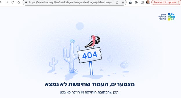
The visual has nothing to do with the Bank of Israel. It shows a bird that has lost its way in the desert. Maybe it refers to the children of Israel wandering 40 years in the desert after leaving Egypt. But what does that have to do with the Bank of Israel?
There are no links at all. You would think they would at least have a link to the home page and other popular pages in the body of the text. And some clever text to show how smart they are
There is no menu at the top of the page to help people find their way to the correct page.
Bank of Israel's 404 error page shows that usability studies weren't performed on the site.
On the English and Arabic site, the page is the same – with the message in Hebrew. Not very helpful to English and Arabic speakers. It is important to usability tests on websites from time to time. Why make it hard for your customers to accomplish their goals?